NYC Planning
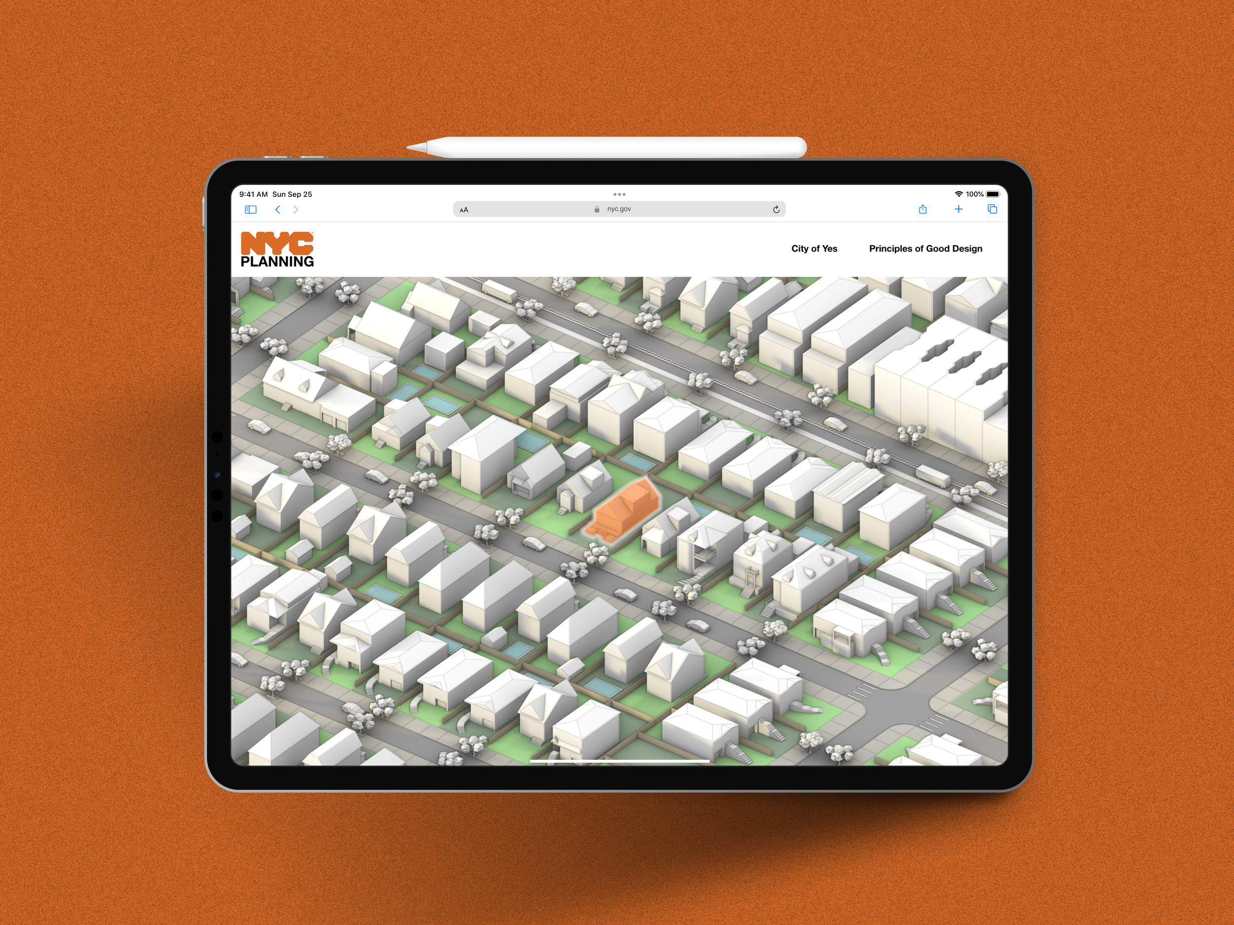
Urban Design Tool
How can we communicate housing opportunity to New York City residents in 3D?
Project Team:
Jesse Hogan (UX/UI)
Luca Moynier (Full-Stack)
Chau Tran (Urban Design)
Gary Chung (Urban Design)
Crystal Jane Eksi (Urban Design)
Timeline:
10 weeks
My time with the agency and this project were both made possible via the Coding it Forward Fellowship, for which I was selected from an applicant pool of 2,500 students across the United States.
Problem Framing
Imagine you’re down on the street with a tablet. How do we communicate the complex process of urban design to the public via that tablet? (communication design piece)
How can 3d models be integrated better and more effectively into public-facing web pages? (technical innovation piece)
Project Goals
Create an interactive 3D model hosted on the web
Include toggles to communicate variations in the built environment
Communicate the DCP's Principles of Good Urban Design
Prioritize a simple and intuitive interface that is replicable and scalable
Weeks 1-4: Project Scoping & Narrowing
Interviews
Interviews with the Urban Design division as well as other stakeholders (Community Planning and Engagement, IT, Zoning divisions) revealed agency-wide energy around housing-related projects and City of Yes initiatives
Centering feasibility led us to low-rise housing projects, given the relative ease with which we could scale and bring the project to life
User Flows
Emphasis was placed on crafting an experience that would be accessible regardless of device or internet speed
Users to be understood as any and all New Yorkers
As a proof-of-concept project, more substantive user research was sidelined in favor of building quickly
Early concept user flows (left, middle) and visual ideation (right)
Weeks 3-6: Low-fidelity design & development
Workflow & Collaboration
Luca and I met routinely to discuss the details of our collaboration and the hand-off between design and development
Urban Design (UD) team support largely came in the form of 3D site modeling and detailing
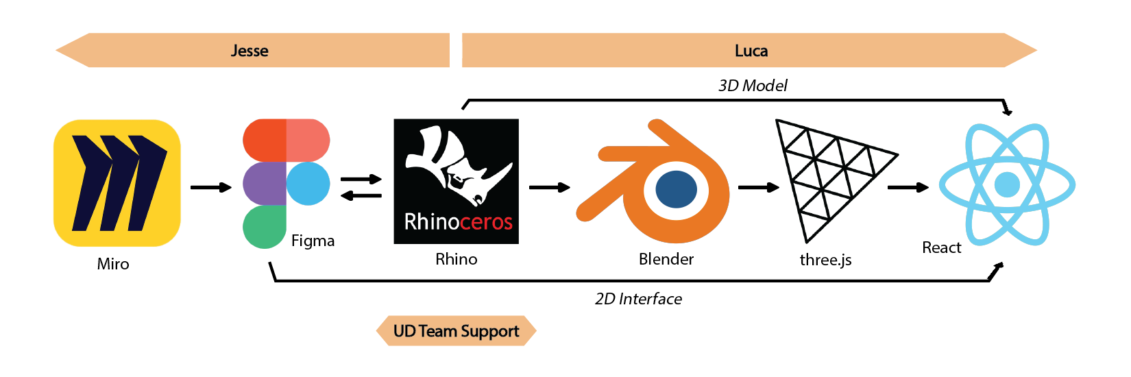
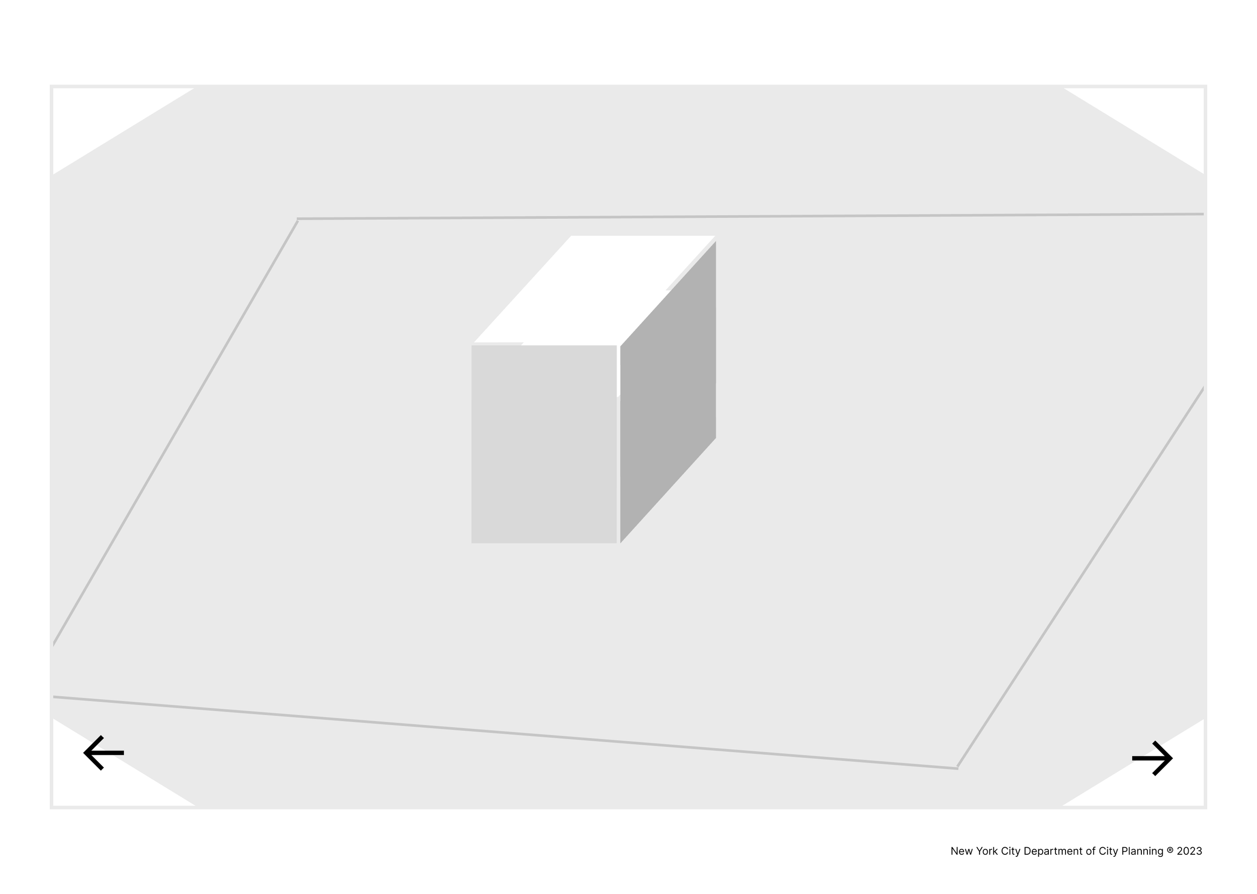
Understanding Scale & Model Constraints
To avoid overwhelming our Luca’s development capacity, we scaled up slowly, from a cube, to a block, and then finally to a full neighborhood model
The more we worked, the larger our 3D model would become, and we needed to pace that expansion with the computational constraint of larger file sizes (again, we wanted the tool to load and function on any device!)


Communication Design
In imagining the potential of this tool’s educational and communicative abilities, we toyed with various iterations:
Is this a game? A click-through or scroll-through story? A model with interfaces housed inside of it?
There was an essential issue we noticed too in tone—should we prioritize the didactic or the interactive?
In trying to distill (and bring joy to) zoning jargon, we also played with the idea of introducing characters or semi-fictional narratives to the project, but we abandond that idea to focus more on the tool’s technical capacities
Given timeline and development restraints as well as our relatively united vision with the scroll/click-through iteration, we pushed forward with it, developing a more fleshed-out prototype for our mid-project review
*note that the code/legal language used in the lofi prototypes is inaccurate, serving mostly as filler text
An early, lofi click-through prototype
The lofi scroll & click-through prototype for mid review
Weeks 7-10: Mid-fidelity design & development
Mid-Review Feedback
Nearly all feedback re-emphasized our initial project goals of producing a replicable and scalable interface
Evidently, creating custom, individual text frames and animations would take more attention to detail and labor in the long run
We were reminded to ask ourselves:
How might this tool come to house more information over time?
How can we design to enable easy input of models and information as opposed to entire redesigns based on content variation?
Pivots
Introductory Carousel — instead of dividing precursory information between both a scrollable webpage and the tool housed within it, we decided to condense the didactic pieces, migrating them all to a carousel inside the tool. Paying attention to textual limits that human cognition places on processing (keeping each slide at or under 350 words so as to not overwhelm users) and carefully selecting imagery, the carousel pivot allowed us to trim down excess and unnecessary information.
Sidebar Interface — creating an expandable/collapsible interface became important as we considered the tool’s need for both scalability and replicability. We realized that allowing space for different information to migrate in and out would also help with accessibility, prioritizing visual consistency and encouraging user interaction in the process.
Introductory Carousel demo
Sidebar Interface demo
Responsive Design
Design for mobile came at the conclusion of the project, and although we were time-limited to execute it in full, certain edits from the web iteration were considered, namely the shapes, sizes, and orientations of the carousel and sidebar

Project Reflections
Future Directions
Near the conclusion of the project, we assembled a list of action items to take the project further if we had time, including:
Expanding the tool to include content from other housing stock (like high-density typologies, campus infills, etc.)
Communicating other City of Yes initiatives beyond those that address housing
Conducting usability testing to refine our design and ensure its accessibility
Updating our imported 3D model to greater fullness
Improving our responsive design
Major Takeaways
In the end, I am super grateful to have had the chance to work with NYC DCP—not only did I get to work on a mission-driven project with the public good in mind, but I also got to take away some important lessons, learning:
How to design between 2d and 3d
How to collaborate between design and development
How architecture and cities are experienced digitally

